A Vibrant Look for a Modern Ballantyne®
Northwood Office refreshes the Ballantyne brand
PROMOTION
Northwood Office has given the Ballantyne® brand a refresh. The catalyst was Ballantyne Reimagined – the company’s master plan to create a more urban, walkable environment in the heart of Ballantyne.
The Ballantyne campus is evolving as not only a high-quality office park, but a regional destination for culture, creativity, commerce and community, and the revision illustrates that progression. The updated look features bold, playful colors and patterns; it captures the vibrancy of the Ballantyne area.
The company shares some insights with Ballantyne Magazine readers below.
The Pattern
The boldest feature of the brand refresh is the Paul Rand-inspired pattern comprised of colorful overlapping shapes, each one a symbol of the future of the Ballantyne area. You will find rolling hills, trees, an amphitheater, office buildings, streams, a cardinal and a heart as the Ballantyne community evolves into “the new heart of the Carolinas.”
The Monogram
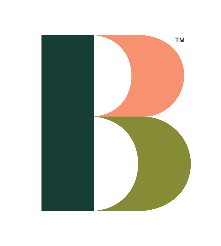
The letter B is well known around the Ballantyne campus, as it adorns streetlights and signs within its 2,000 acres. Northwood has kept this identifiable symbol but updated it to reflect a more colorful, modern design. The current glyph varies from thick to thin, a nod to the land’s topography. The B is a versatile accessory to the word mark that can display three colors, symbolizing the diversity of the campus.
The Word Mark
The Ballantyne word mark is the foundation of the brand. The team opted to keep this design simple and bold, using capital letters to instill confidence and establishment, with slanted corners on the Ls and T as a nod to architecture. The curves of the B and As add a playful and casual touch and pay tribute to the legacy brand.


